PolicyKraft.com was an interesting project to work on as it was my first website for an insurance company.
Insurance always seems to be a boring topic in everyone's mind. And I wanted to change that.
Keeping in mind the professionalism of the topic. I also wanted to play around with color and make it seem more enjoyable to look at.
With this in my, I started to design the website.
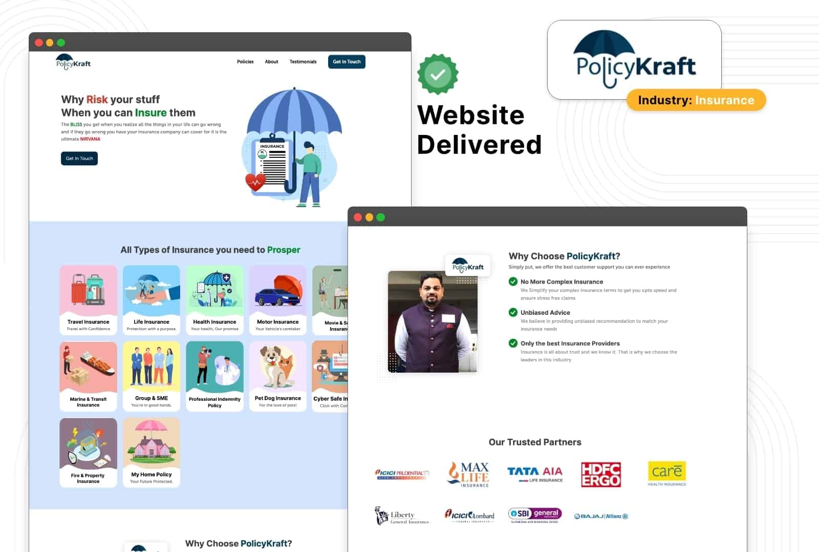
I used Illustrations and other creative elements for this project to make it stand out.
With thoughtful illustrations and icons all over the website, representing the type of insurance offered by PolicyKraft
The basics of a good website were given much importance. At the end of the website, a website is an asset for the business that helps with selling the service the company is offering.
So effective CTA (Call to Action) was implemented above the fold in the hero section of the website.

All the Types of insurance that the company offers were placed right below the Hero sections of the website.
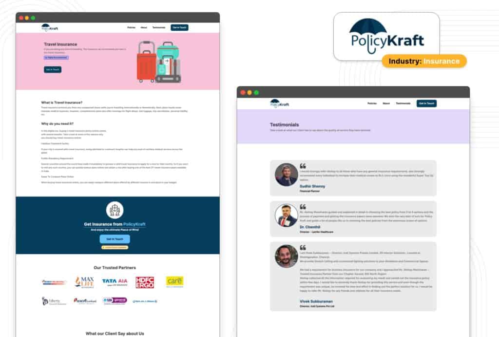
These insurance types can be updated in the backend, without the need to build entirely new pages. As the insurance page was made into a template and would update content based on the backend information provided.
A custom post type was used to make this happen. I used Oxygen Builder to build the entire website.
Right below the "Types of Insurance" section, there was a small about section. Highlighting the USP (Unique selling points) of PolicyKraft
Below, there is a list of Insurance partners PolicyKraft has partnered with to give a sense of Social Proof and the insurance companies listed here are quite popular amount adults in India.
Below the "Trusted Partner" section, we have added the list of certificates the founder has received with respect to his service in this industry.
Big Call to Action is highlighted below the certificate, which encourages the user to take action and contact the company for getting their insurance.
Below the section, we have testimonials sections for another social proof of the kind of service a potential buyer can expect from PolicyKraft once they are ready to commit.
A Neatly integrated footer gives access to the Different sections of the website including a separate About page, Testimonials page, and a Contact page.
We also have separate "Policies" pages with all the types of insurance PolicyKraft provides.
The Client loved the website and showed it to many of their peers who also wanted a similar website. So it was a win-win situation for both myself and the client.